Revolution Beer
— Design Investigation —
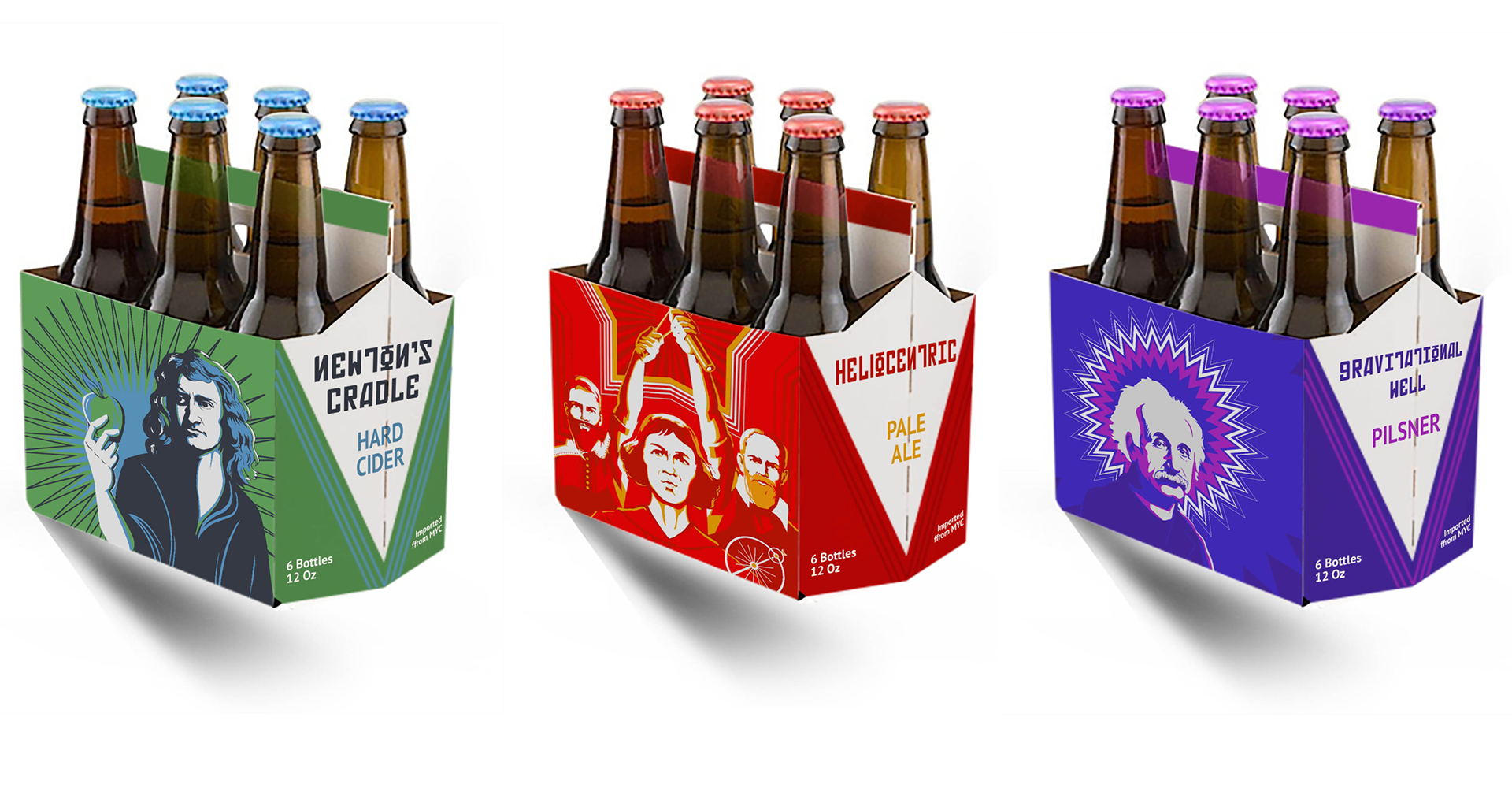
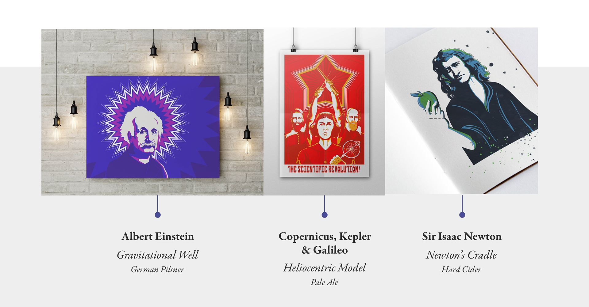
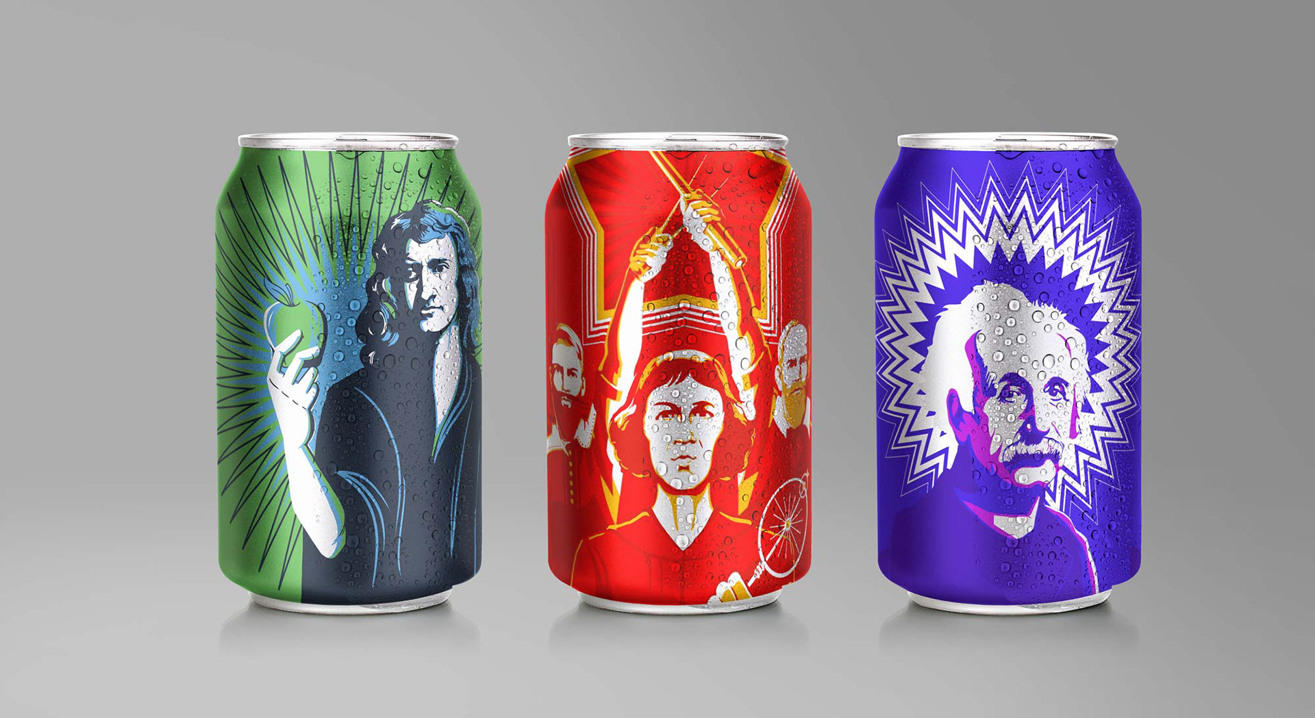
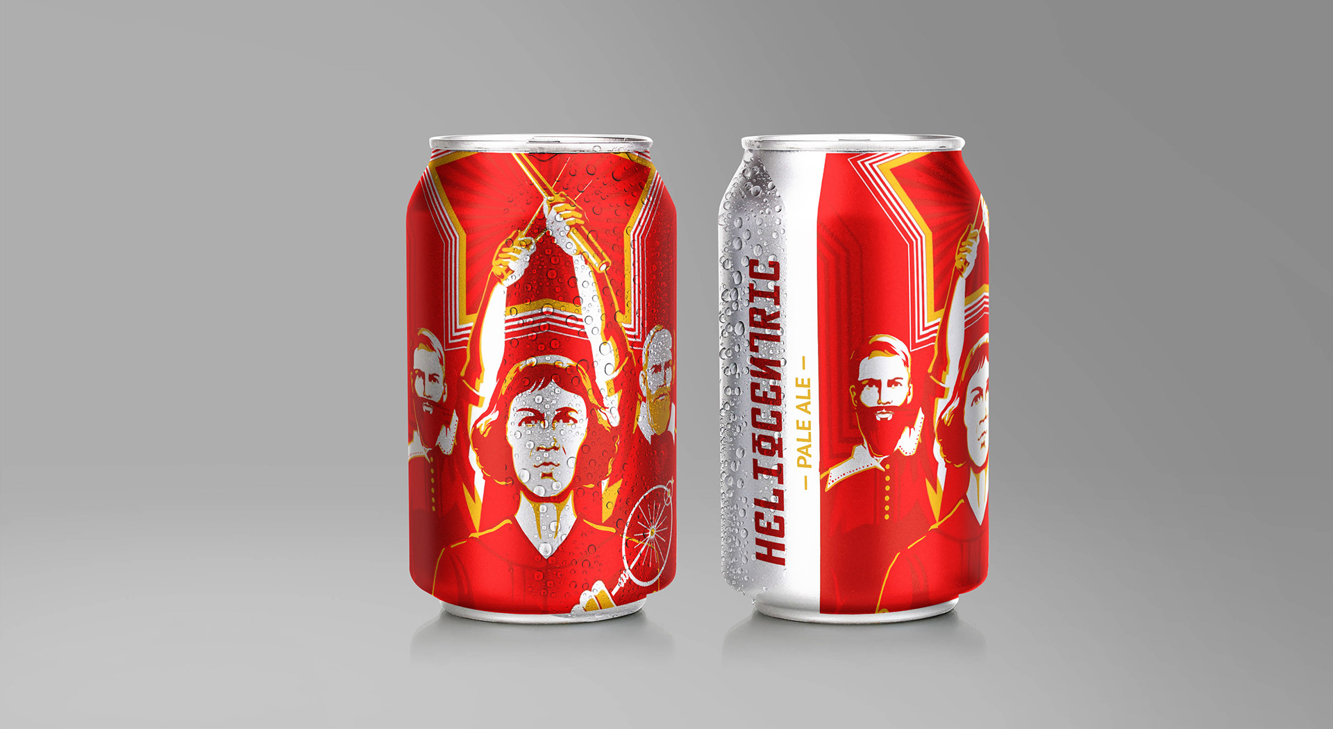
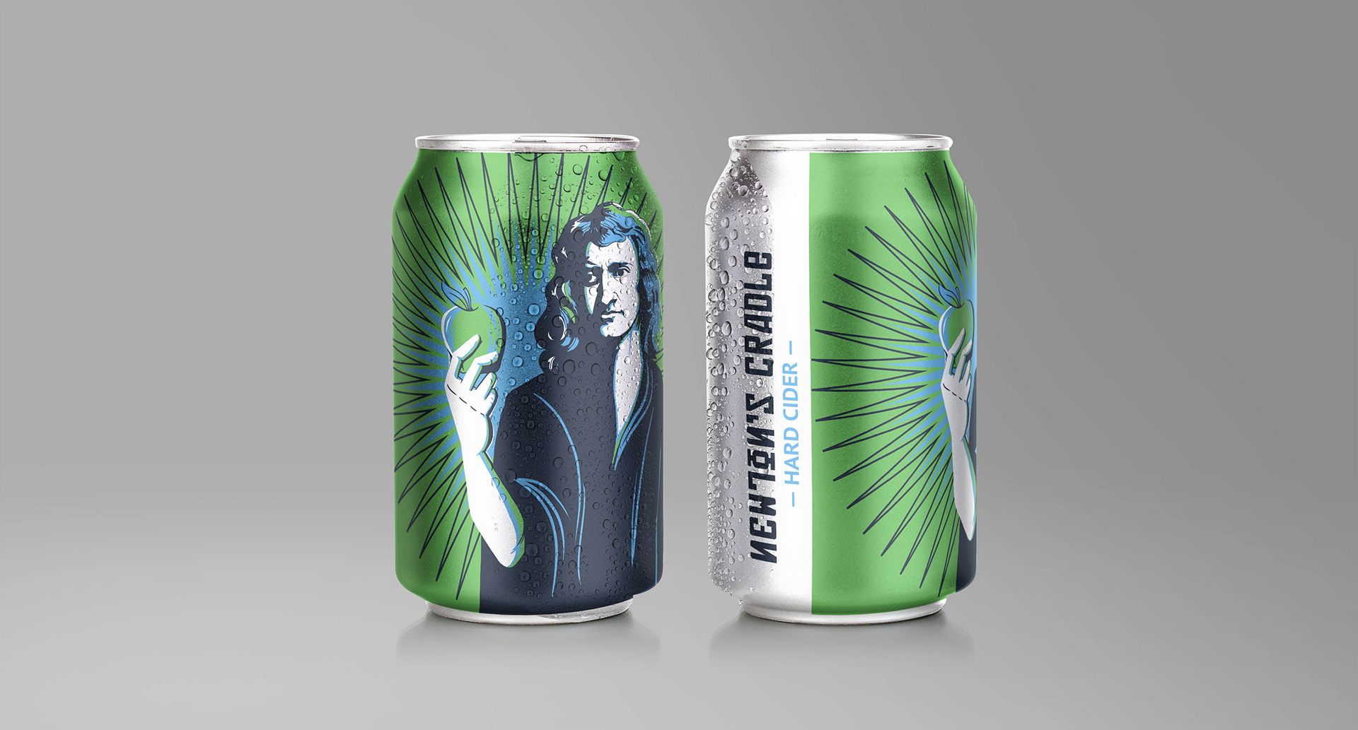
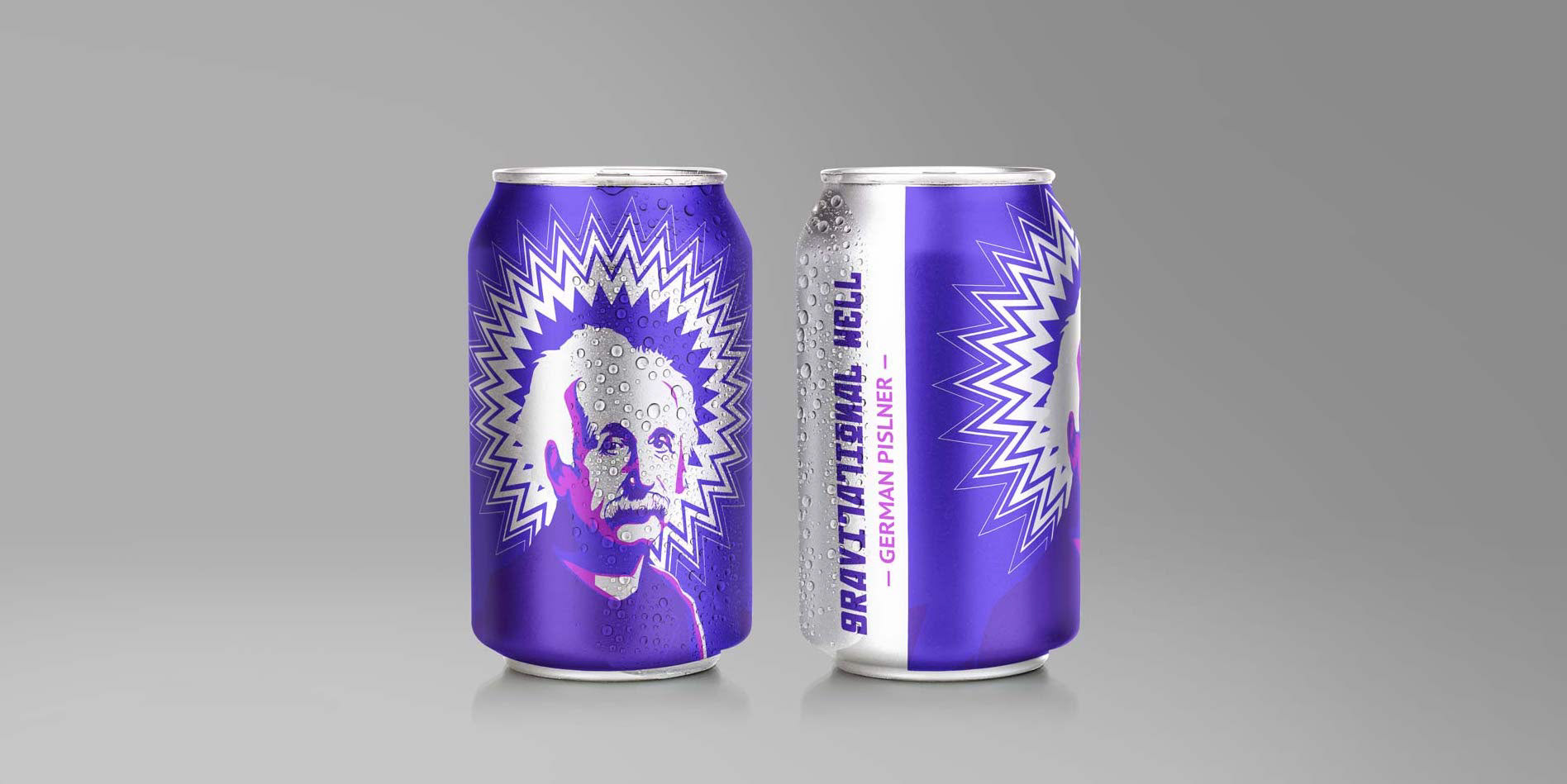
A self-initiated project involved the combination of artwork on a series of scientific figures with a hypothetical “Revolution Beer Co.” brand. Each scientist was matched with a beverage type that have loose associations with each personality.
— Color —
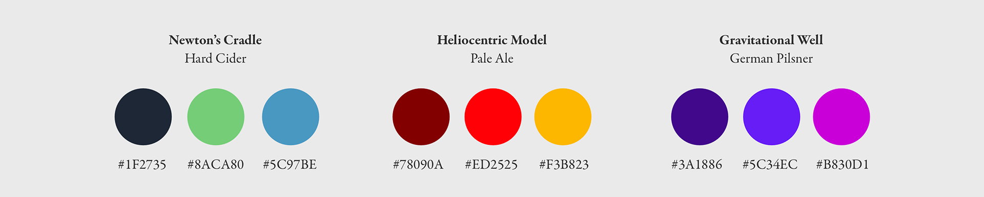
Color and shape were used to bring consistency throughout the brand. The original artwork utilized near-triad tricolor treatments. While based on different ranges, they provided a clear design theme. The use of star shapes with differing points numbers and amplitudes also tied each design together.
— Type Treatment —
With the name of the brand about a revolution, the font choice for the titles was inspired by Soviet script. To match this decorative font, a simple sans serif was used to complement. The type was given the same color treatment, using the darkest color as the brew name, and the highlight as the brew type.