website design
3DPrint.com is a online news organization dedicated to the 3D printing industry. In 2018 they requested an update to their website with a number of requirements. These included:
1: A fresh and professional new feel
2: A site that looks first and foremost like a “news” site
3: A clear distinction between news content and ads
4: An improved site structure
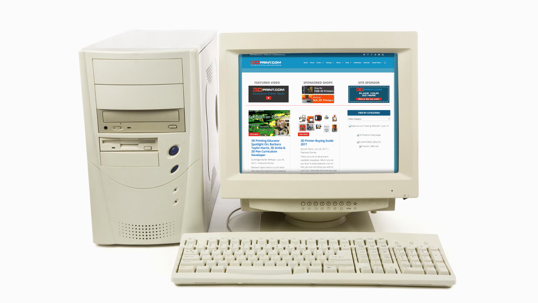
At first glance, it was hard to determine what 3DPrint.com site was about. The old site also had a very confusing site structure, with forms and content placed on multiple pages, with no clear distinction between intent and purpose.
Site design
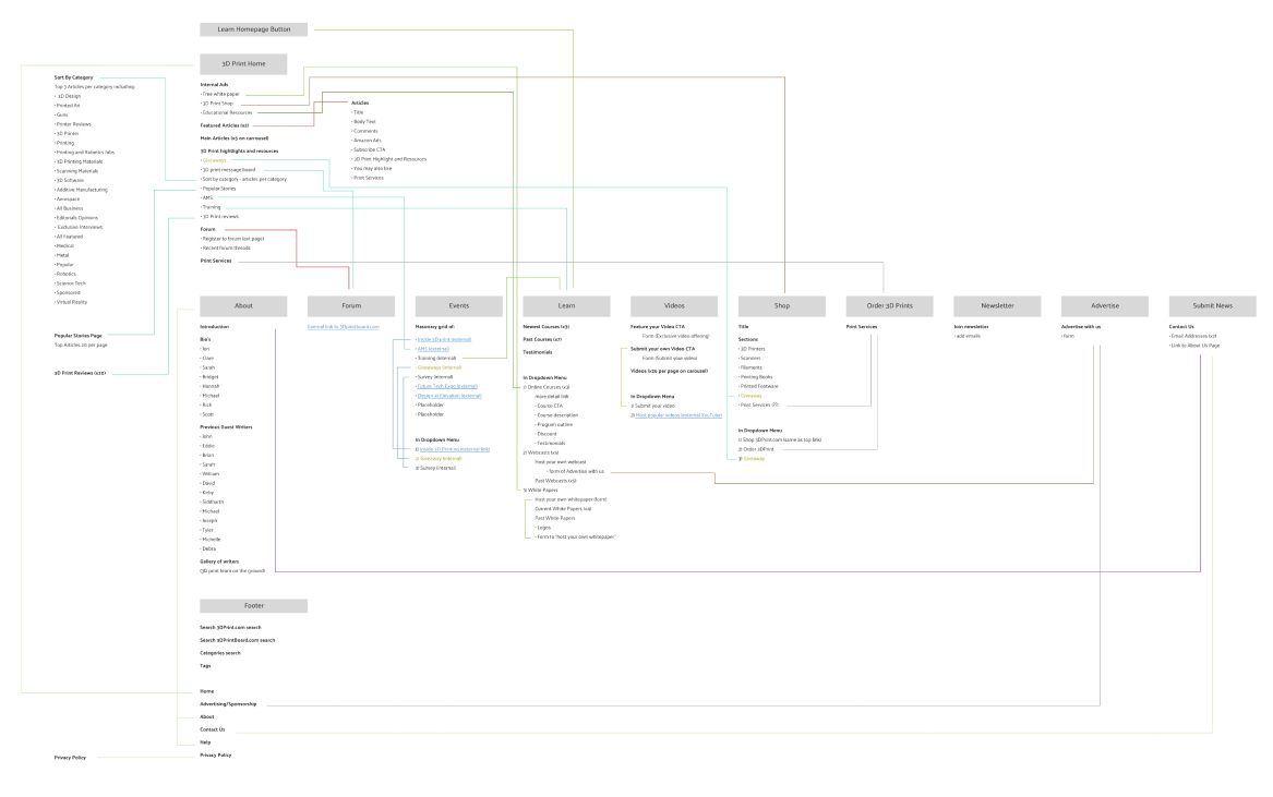
Site Map
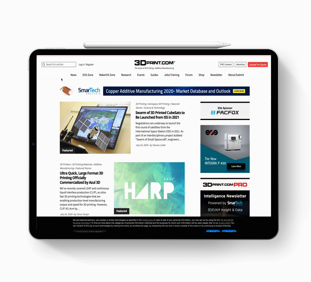
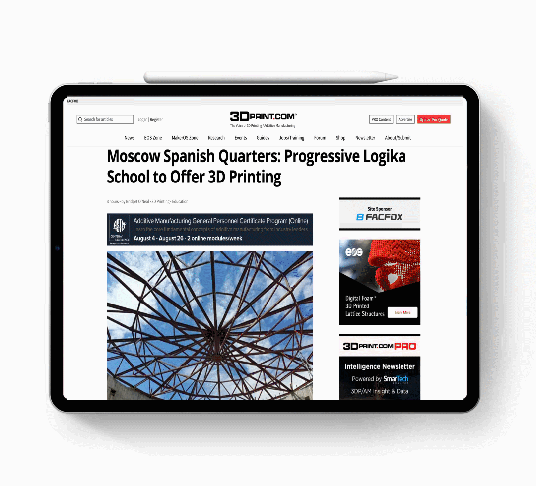
The site design process began with the reimagining of the site map. The existing content structure was complex, hard to navigate and in many cases the content was duplicated across multiple pages.
Taking inspiration from sites like Bloomberg, I restructured the home page to include the most recent news items at the top of the page, with the remaining important content elements included below for quick access, while relegating other items to alternate pages.
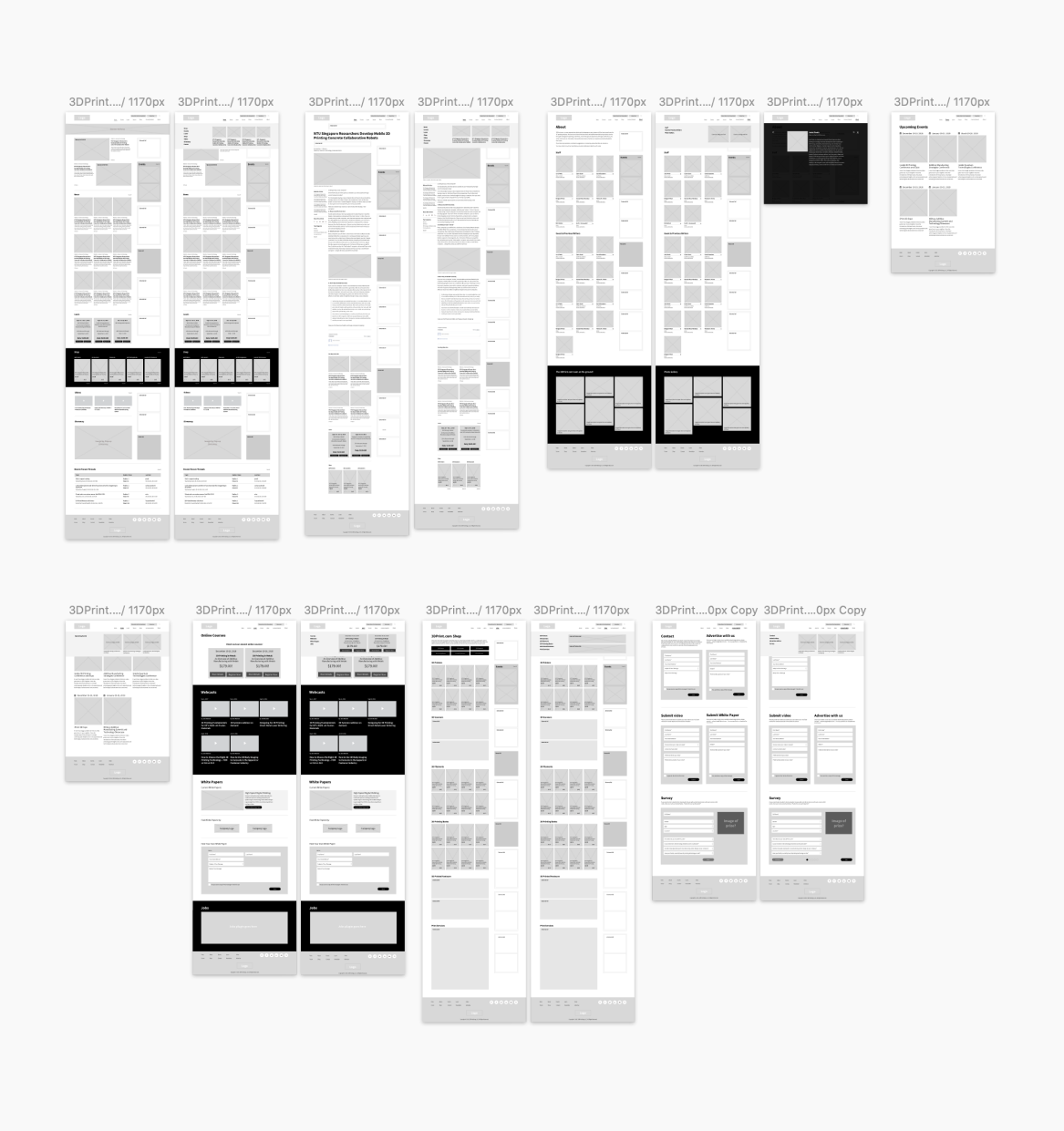
Wire frame
The wireframe was developed in Sketch with an intent to show a high level variant of the site design. It showed where content would be placed, and how elements would relate to each other. This was presented to the client via the InVision app. for approval before moving further into the project.
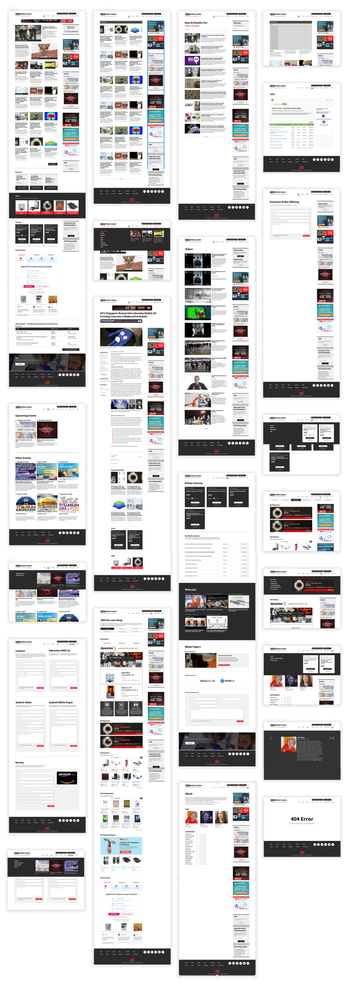
Prototype
The prototype was created in Sketch from a continuation from the wireframe and using existing content from the old site. The color, typography, graphic elements and photography were included to provide the client with an accurate visual of how the site would look, before any coding took place.
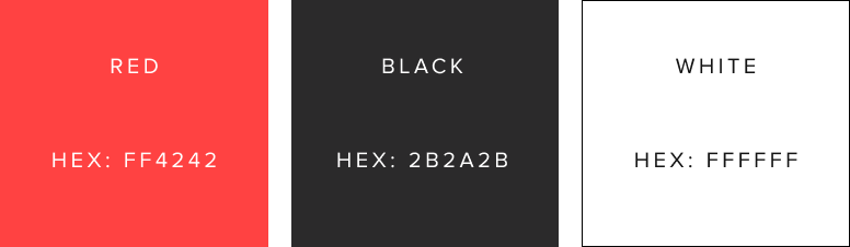
Color
The color palette was limited to white, black and occasional red to highlight important features, and to maintain the fresh and professional feel the client requested. This new color system also inspired an update to the 3DPrint.com logo.
Type
The typography was selected for ease of use and universality. A clear heirachical system was developed for the headers, body copy, to tags, to assist in the user experience of the densely packed site.

Top Menu
An elaborate top menu system was developed so that with a mouse hover, additional content would be displayed allowing the client to add pertinent information for potential new articles or events.
Sticky Side Blog Menu
While scrolling down an article, a sticky side menu was designed so that important elements can always be within a click of the mouse, including social media links and related articles.